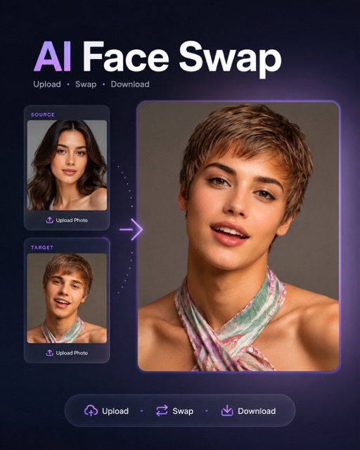
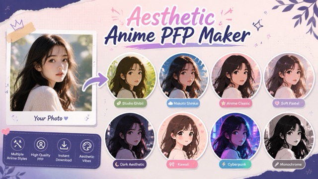
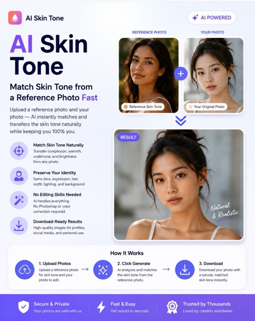
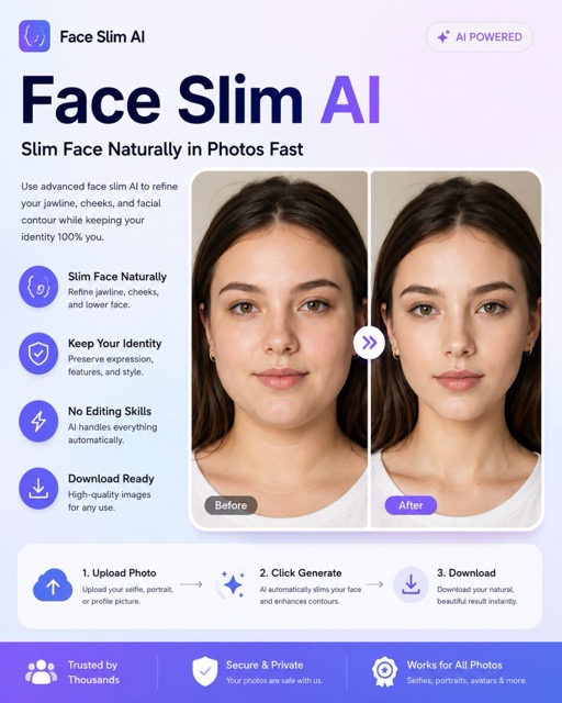
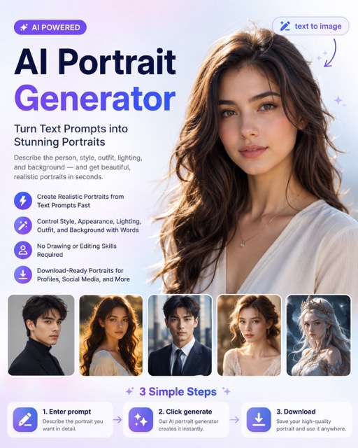
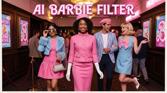
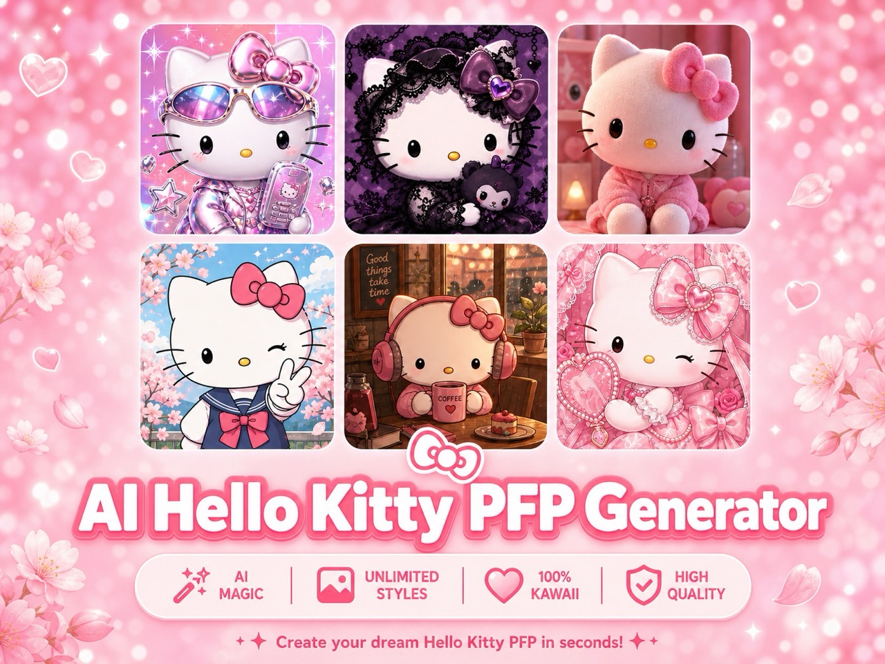
More AI Image Generators
Explore our collection of specialized AI image generators designed for different creative needs and styles


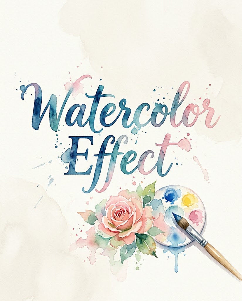
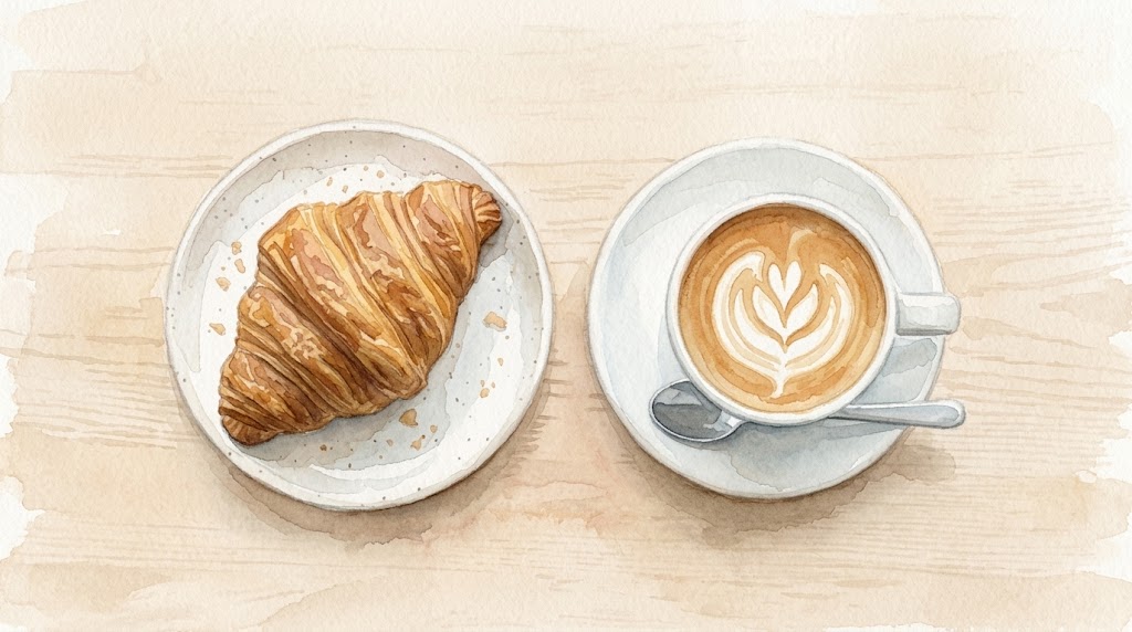
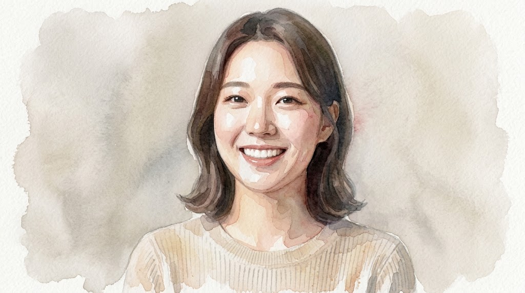
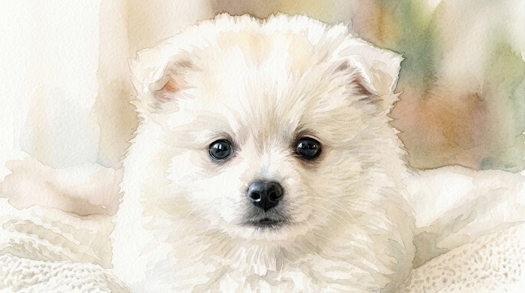
Turn Photos into Watercolor Art with Watercolor Effect
Use Watercolor Effect to convert everyday images into gentle watercolor-style visuals.
Use this Watercolor Effect when you want the original composition to remain recognizable while the colors, textures, and edges feel softer, lighter, and more painterly.
How to Use Watercolor Effect
The workflow is intentionally simple: upload an image, choose the image size, and generate a refined Watercolor Effect. Instead of building a painted look, you can explore a finished Photo to Watercolor direction in minutes.

Upload Your Photo
Start by uploading the image you want to restyle. The Watercolor Effect works best when the subject is clear, the lighting is stable, and the background does not compete with important details. You can use portraits, pets, flowers, buildings, travel memories, or product photos. For cleaner Photo to Watercolor results, choose an image with enough contrast for the model to read the main shapes.

Choose Image Size
Select the image size that matches your final use. A square format works well for profile visuals and shop thumbnails, while vertical images suit posters, covers, and mobile content. The Watercolor Effect adapts the painted look to the selected ratio, so the output feels composed rather than cropped accidentally. This step helps Photo to Watercolor results stay practical for publishing.

Generate and Save
Click generate and review the Watercolor Effect result. Look for balanced color bleeding, readable facial structure, and a natural paper-like softness around edges. If the source image is complex, try a simpler crop or a different ratio. Once the output fits your purpose, save it for social posts, mood boards, digital stationery, brand tests, or lightweight creative campaigns.
Best AI Image Tools for Creative Projects
Explore creative tools for image, learn tips and tricks, and see how AI can be your assistant in turning concepts into finished projects.
Features of Watercolor Effect
Whether you need a soft portrait, a travel poster, or a branded seasonal visual, the Watercolor Effect gives you a balanced starting point for design and publishing.

Soft Portrait Painting
Use Watercolor Effect to turn portraits into gentle painted images while keeping the person easy to recognize. The model softens skin transitions, lightens harsh contrast, and adds delicate color variation around hair, clothing, and background shapes. This is useful for profile art, couple portraits, family keepsakes, creator banners, and editorial-style thumbnails. Photo to Watercolor works especially well when the original face is clear.
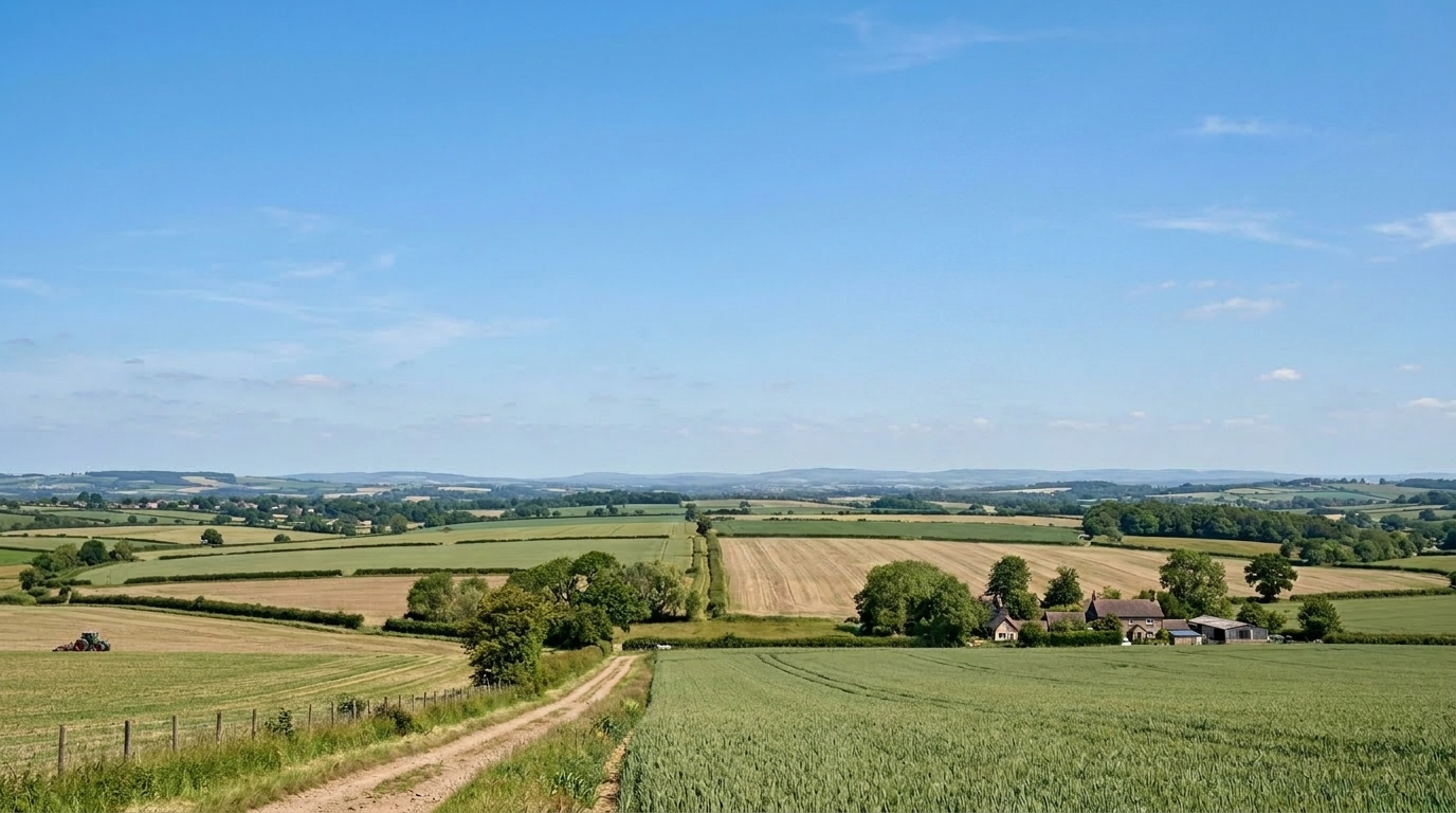
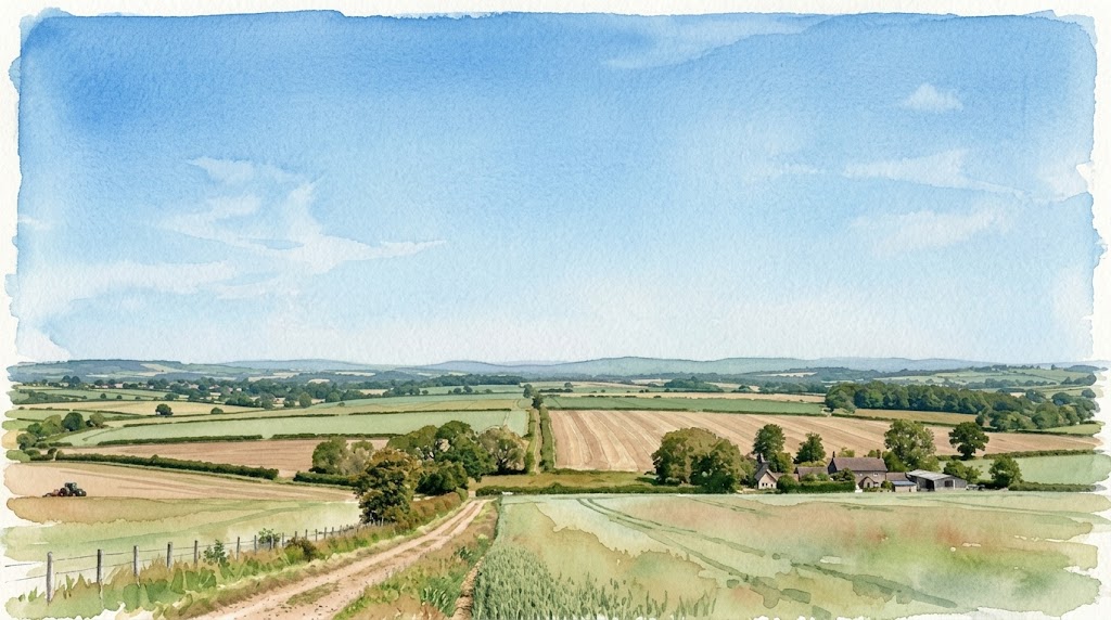
Travel and Landscape Washes
Watercolor Effect can reinterpret streets, beaches, mountains, cafes, and city views with a softer travel-journal feeling. It keeps large shapes readable while adding transparent washes and relaxed edges. Instead of making every detail equally sharp, the Watercolor Effect emphasizes atmosphere, color temperature, and composition. Use it when a normal travel photo feels too literal but you still want the location to remain recognizable.
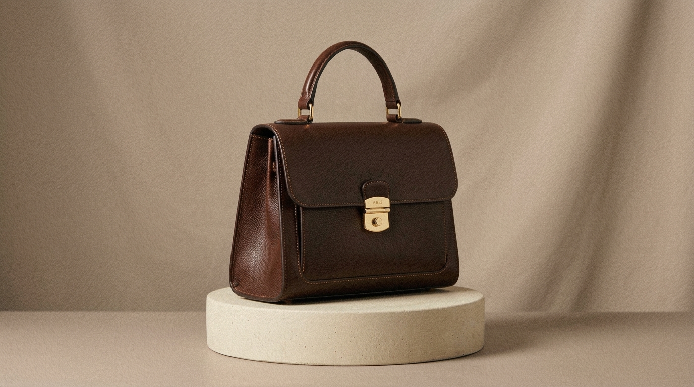
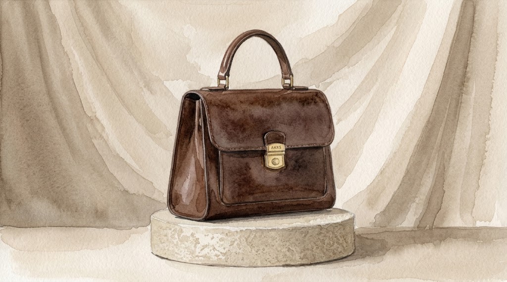
Product and Brand Mood Images
For lifestyle brands, stationery shops, cafes, florists, and handmade sellers, Watercolor Effect can create softer product visuals for mood boards and campaign drafts. It is not meant to replace accurate catalog photography. Instead, the Watercolor Effect gives you a more editorial version of a product scene, useful for seasonal banners, gift guides, announcement graphics, and early creative direction before a full design pass.

Pet, Flower, and Memory Art
Watercolor Effect is a strong fit for emotionally warm subjects such as pets, flowers, childhood photos, home corners, and quiet daily moments. The painted texture makes the image feel less like a raw snapshot and more like a personal illustration. Photo to Watercolor can help preserve the core subject while giving the final piece a calmer tone for cards, frames, journals, or remembrance pages.
Why Choose Watercolor Effect for Creative Images
Watercolor Effect is useful when a normal photo feels too direct and a full illustration takes too much effort. It sits between photography and hand-painted art, giving your image a softer personality while preserving the main subject.

Social Content with a Handcrafted Feel
Use Watercolor Effect when your social content needs a softer visual identity than standard photo filters can provide. It works well for creator announcements, profile updates, quote cards, travel recaps, and lifestyle posts. The Watercolor Effect adds artistic texture without requiring you to learn digital painting. This gives casual content a more crafted look while keeping the original image easy to understand.

Invitations, Cards, and Event Graphics
Watercolor Effect is useful for birthdays, weddings, baby showers, classroom events, and small business invitations. Upload a portrait, venue photo, floral image, or product scene, then use the result as a soft visual base. The Watercolor Effect can make event graphics feel warmer and less commercial. Add typography afterward to create a polished card, poster, or digital invitation.

Mood Boards for Creative Direction
Designers, marketers, and founders can use Watercolor Effect to test a more delicate art direction before committing to a campaign. It helps translate ordinary references into a shared visual language for colors, textures, and emotional tone. Because the Watercolor Effect keeps the image subject visible, teams can compare options quickly and decide whether a softer painted style fits the brand.

Personal Keepsakes and Memory Pages
A personal photo does not always need a dramatic edit. Sometimes it only needs a gentler presentation. Watercolor Effect can turn a family portrait, pet photo, travel memory, or home snapshot into a keepsake-style image with a calm painted finish. The Watercolor Effect is suitable for digital albums, journals, framed prints, tribute pages, and small gifts.

Blog, Newsletter, and Editorial Visuals
Watercolor Effect can help writers and editors create softer header images for lifestyle essays, travel posts, recipe notes, personal newsletters, and educational articles. The Watercolor Effect reduces the overly literal look of stock-style photos and makes the image feel more tailored to the topic. It is especially useful when you want a quiet, refined visual rather than a loud promotional graphic.

Early Concept Images for Small Brands
Small teams often need visual ideas before they have a full design budget. Watercolor Effect gives them a fast way to explore seasonal campaigns, packaging moods, cafe menus, product stories, and landing page art. The Watercolor Effect should be treated as a creative draft or stylized asset, not a replacement for final brand guidelines, but it can move early decisions forward.
What Users Say About Watercolor Effect
Creators use Watercolor Effect for different reasons: softer portraits, clearer mood boards, and more distinctive editorial images. The best results usually come from clear source photos and a specific publishing goal.
I used Watercolor Effect for a wedding welcome sign concept, and it gave the couple’s venue photo a softer, more personal feel. The image still looked like their garden, but it no longer felt like a plain snapshot. I could test several layouts quickly and send a polished direction before opening my design software.
For travel newsletters, I do not always want sharp documentary photos. Watercolor Effect helps me create a calmer header image that supports the story without overwhelming the text. My favorite use is turning street scenes into light editorial illustrations. It gives the article a more thoughtful opening and makes each issue feel more designed.
I run a small candle brand, and Watercolor Effect has been helpful for seasonal mood images. I upload simple product photos, choose a vertical size, and use the output for campaign planning. It is not my final catalog shot, but it helps me explore color direction, packaging atmosphere, and social post ideas much faster.
I tried Photo to Watercolor on pet portraits for a local shelter campaign. The painted look made the dogs feel warm and approachable without hiding their expressions. We used the images for adoption story posts, and the style helped the visuals feel consistent even though the original photos came from different volunteers.
Watercolor Effect is now part of my early concept workflow. When a client asks for a softer brand mood, I can turn their existing reference photos into painted directions and discuss what works. It makes the conversation more concrete because everyone can see the difference between a bright commercial image and a gentler illustration style.
I use Watercolor Effect for classroom materials and parent newsletters. A normal classroom photo can sometimes feel too busy, but the painted version becomes friendlier and easier to place beside text. It helps me create covers, activity recaps, and seasonal cards without spending extra time on complicated design adjustments.


FAQs About Watercolor Effect
The goal of Watercolor Effect is to help you get better Photo to Watercolor results without overcomplicating the workflow.
Watercolor Effect is an AI-powered image transformation tool that turns uploaded photos into watercolor-style images. After you upload a photo and choose an image size, Banana Pro AI interprets the main subject, color relationships, and visual structure, then applies soft washes, relaxed edges, and painterly texture. The Watercolor Effect is useful when you want an artistic look while keeping the original scene recognizable.
Photo to Watercolor means converting an existing photo into a watercolor-style image instead of generating a scene from scratch. The original photo guides the subject, pose, layout, and major colors, while the AI changes the finish into a painted look. Photo to Watercolor is helpful for portraits, pets, travel images, product concepts, invitations, and editorial visuals that need a softer art direction.
Watercolor Effect works well with clear portraits, pets, flowers, landscapes, buildings, food images, and lifestyle product photos. Images with strong lighting, readable subjects, and uncluttered backgrounds usually produce cleaner results. Very dark, blurry, crowded, or heavily compressed photos may still work, but the Watercolor Effect can struggle to separate important details from noise. For best results, start with a photo that already has a clear focal point.
The Watercolor Effect aims to keep the main subject recognizable, but it will intentionally soften details because watercolor style is less precise than photography. Faces, pets, and products usually remain clear when the source image has good resolution and lighting. Small text, tiny patterns, and complex backgrounds may become less readable. If accuracy matters, use the Watercolor Effect as a stylized visual rather than a technical reproduction.
Yes. Watercolor Effect is suitable for social posts, thumbnails, banners, blog headers, digital cards, mood boards, and concept visuals. For commercial use, make sure you have the rights to the original image and any people, products, or locations shown in it. The Watercolor Effect can help create a more distinctive visual style, but legal usage still depends on your source material and publishing context.
Choose the image size based on where the final image will appear. Square works well for profile posts and product thumbnails. Vertical formats fit posters, mobile stories, invitations, and cover images. Horizontal formats are better for blog headers, website banners, and presentation slides. The Watercolor Effect will follow the selected ratio, so deciding the layout first can reduce awkward cropping and make the result easier to use.
A standard filter usually applies a fixed overlay or color adjustment. Watercolor Effect uses AI to reinterpret the uploaded photo with a painted style, so the result can respond more naturally to subjects, edges, lighting, and composition. This does not mean every output will be perfect, but the Watercolor Effect can feel more tailored than a simple preset when the source image is clear.
To improve Photo to Watercolor results, begin with a clean, well-lit image and avoid overly busy backgrounds. Crop around the main subject before uploading if the scene has too many competing elements. Choose the image size for the final channel, not just for previewing. If the first Photo to Watercolor result feels too crowded, try a simpler source photo or a composition with more negative space.
Create a Softer Painted Image Today
Upload your photo, choose an image size, and use Watercolor Effect to create a gentle watercolor-style version for social posts, cards, mood boards, or personal keepsakes. Banana Pro AI Watercolor Effect gives you a practical Photo to Watercolor workflow when you want a polished painted look without manual editing.